Basic Introduction
2008 Media Marketing is a media buying company established in 2008, which operates media and advertising for many large brands.
The 2008 media marketing official website project, implemented in 2014, is flying. One of the cases of the official image website of creative interaction and advertising agency cooperation.
In response to the increasing importance of smartphones and tablets, a dual-site design approach is adopted to meet the overall needs of desktop and mobile devices.

Concept of Design
Minimalism, Zen style, and sense of design are the main axis of the overall design of the website
The client hopes that the official website can convey the excellent strategy and ability of 2008 Media Marketing in managing the media plan for the client, and the setting of the style is special and outstanding!
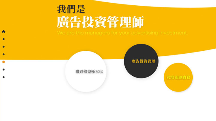
The design team proposed this set of design proposals that mixed Japanese Zen style, minimalist style, and a little futuristic design on the graphic lines.
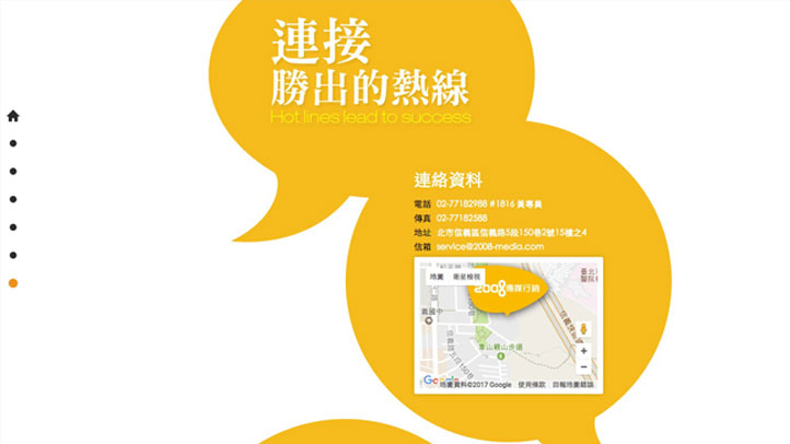
In terms of interactive design, the entire desktop version and tablet version of the website can be slid and displayed on a straight, super long screen. Users can quickly click to browse the page, and the screen elements will be scattered and combined. The method is assembled, and the composition of the picture is very interesting.
Using HTML5 related technologies, when browsing the website, the content display and screen design can be simultaneously improved.
* Copyright 2008 Media Marketing
Color Scheme
Luo yellow is the main color, and white and dark gray are used as an overall match
The main color used in color is the standard color luo yellow of 2008 media marketing.
White is used as a clean background color. In addition, dark gray and cut gray are used as other colors used in the website.
R250 G186 B0
#FABA00
R255 G255 B255
#FFFFFF
R110 G110 B110
#6E6E6E
R0 G0 B0
#000000
Desktop version
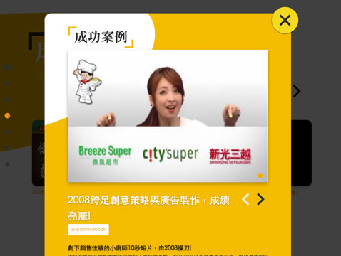
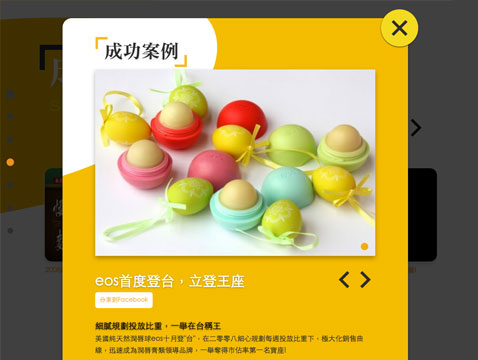
Make full use of the performance of the desktop machine, so that the horizontal large screen presents the best effect
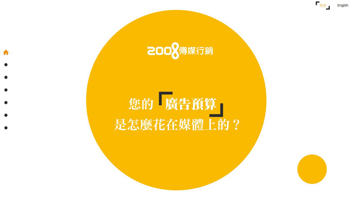
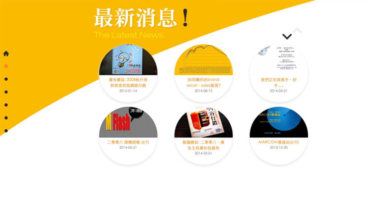
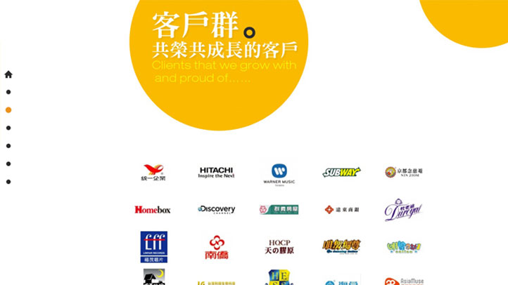
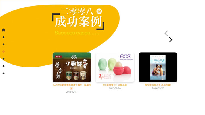
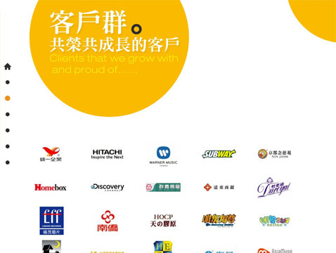
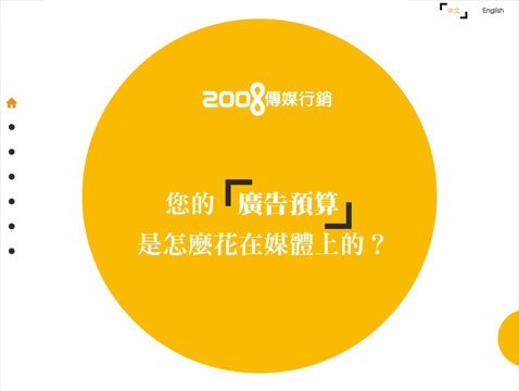
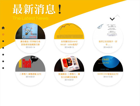
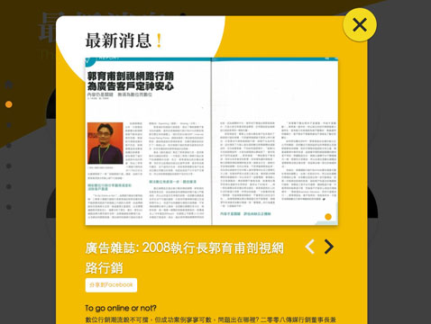
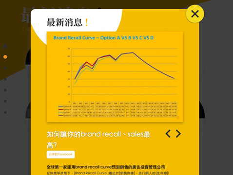
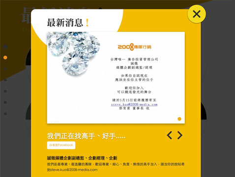
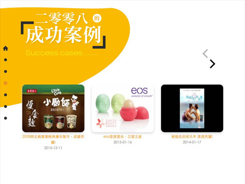
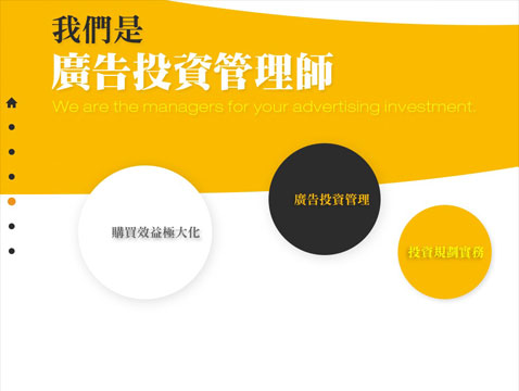
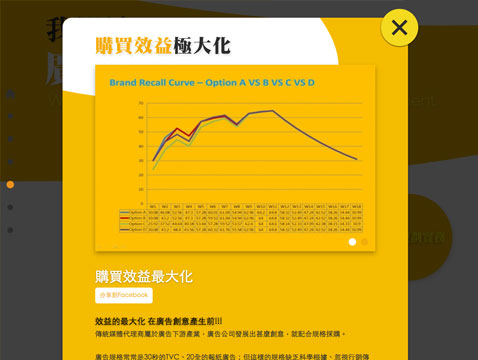
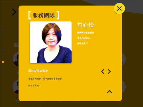
The homepage of the desktop computer version is designed with multi-level sliding and parallax. The minimalist and Zen-style visual image guides the visiting users to enter the inner page and browse each unit, so that the concept of 2008 media marketing, Success testimonials... quickly browsed by users one by one from the shallower to the deeper.
The homepage of the desktop version of the website, which supports desktop computers, tablet computers, and notebook computers at the same time.
Support PC / Mac desktop computer, notebook computer, browsers above Chrome, Safari, Firefox and IE9.
* Copyright 2008 Media Marketing
Tablet Version
Streamlined and optimized version for smooth browsing on tablets
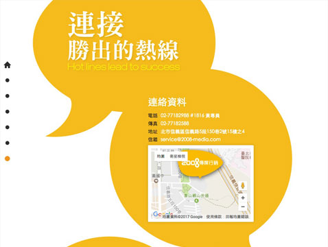
Tablet computer users will be guided into an optimized tablet version, which is specially designed so that the content of the entire website can be fully presented on the tablet computer.
Support iOS / Android / Windows tablets.
* Copyright 2008 Media Marketing
Smartphone Version
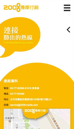
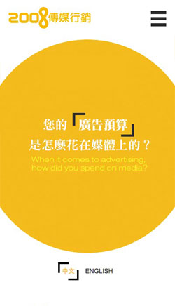
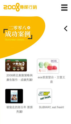
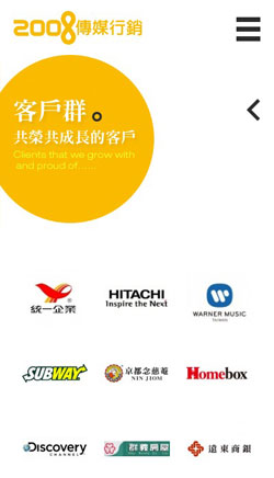
Redesign the vertical screen for mobile phones, and browse the website smoothly with one hand
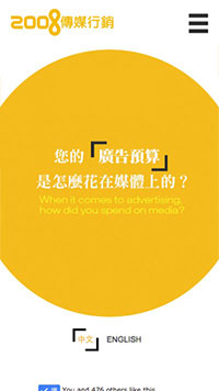
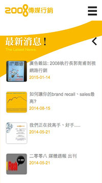
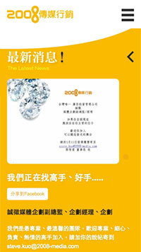
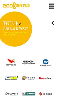
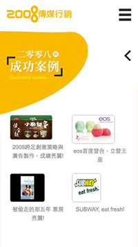
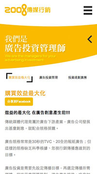
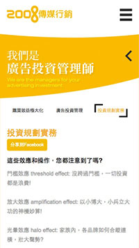
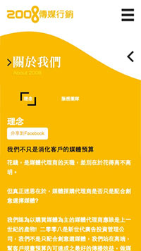
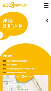
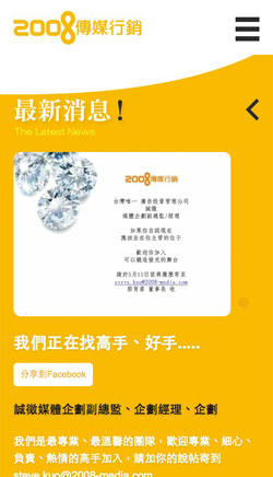
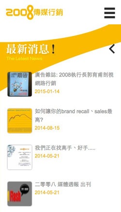
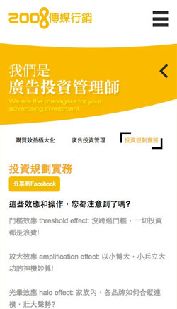
For the smartphone version, the design team re-planned the operation interface, using clear menus, so that mobile phone users can quickly switch pages or units to find the information they need.
The minimalism, Zen style, and design sense of the desktop computer version can also be seen in the smartphone version, making the overall vision more consistent.
Support iOS / Android / Windows smartphones.
* Copyright 2008 Media Marketing
Related cases
Related cases
Vieshow Cinemas
iShow Card Offical Website

Related cases
Uncle Liao's Health House

