Basic Introduction
GRIMM PRESS LTD. is a Taiwanese publishing house that provides a variety of books, including children's books, educational books, travel guides, etc., and owns the online bookstore Green Picture Books.com.
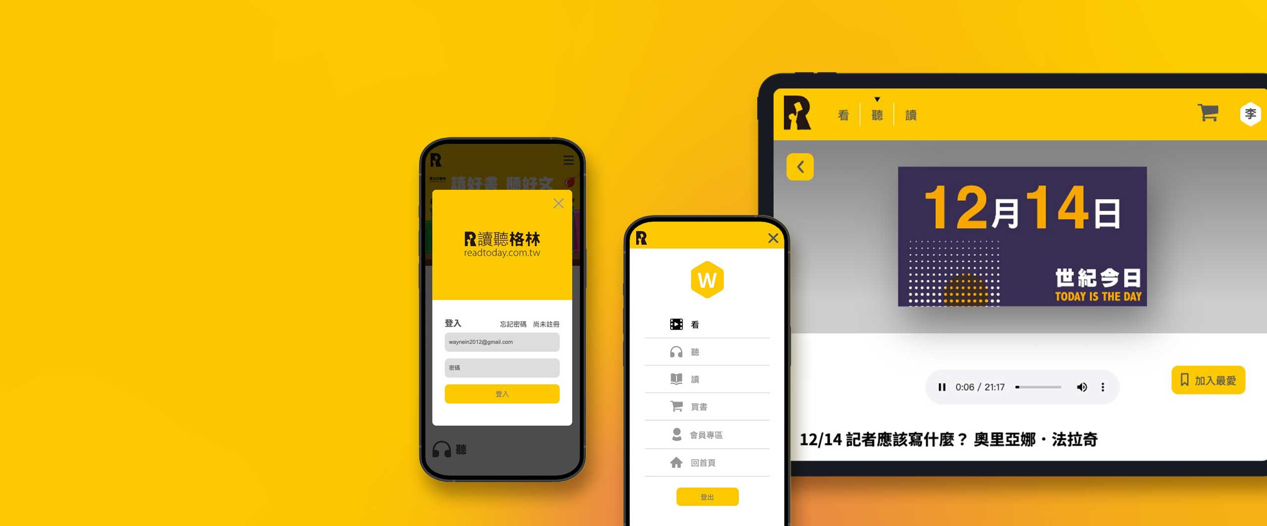
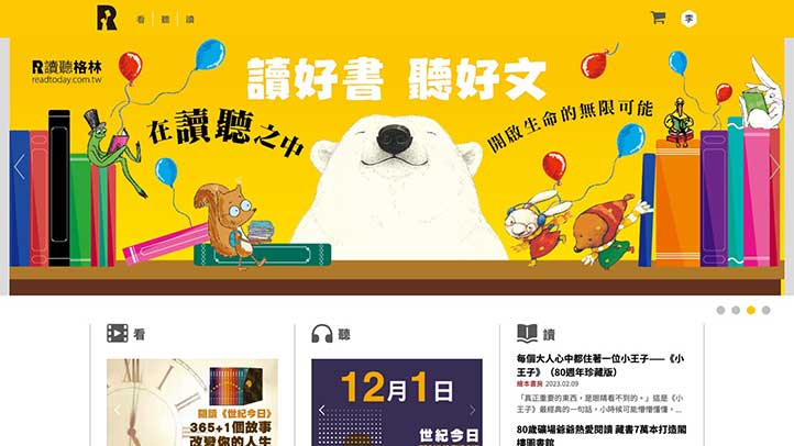
The design task this time is to establish an official audio-visual content platform for Green Culture, and make the overall style of the website consistent with the brand, so that readers can find more oriented content and information on this website.
In response to the increasing importance of smartphones and tablet computers, the RWD (Responsive Web Design) responsive website design method is adopted to meet the overall needs of desktop computers and various mobile devices.

Concept of Design
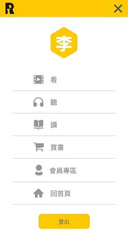
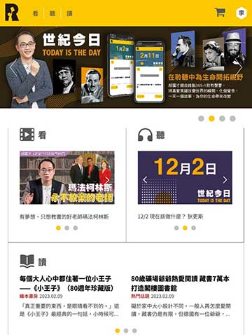
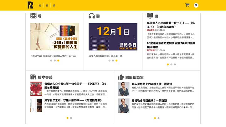
Cut into the world of children's books from the three directions of reading, listening and reading, so that readers can have a more comprehensive understanding of Green culture
The three key functions are as follows:
look|
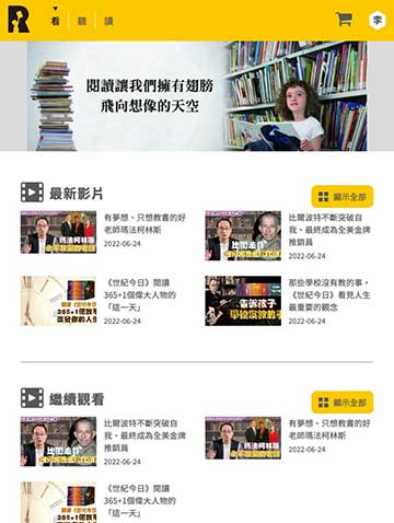
This unit has produced many videos by Green Culture, so that readers can watch the videos to quickly enter the plot you are interested in.
listen|
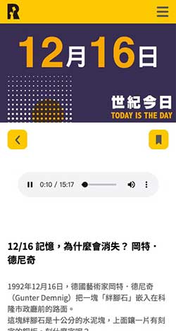
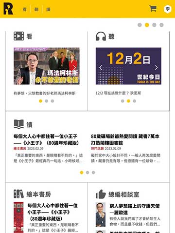
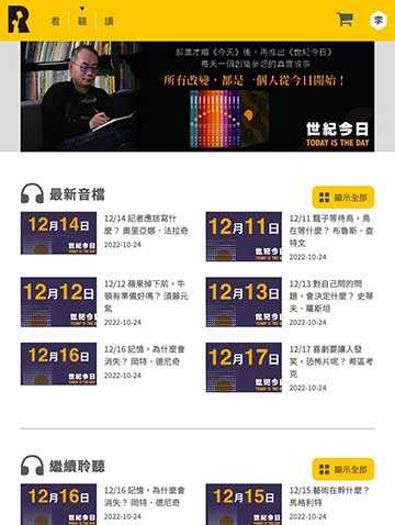
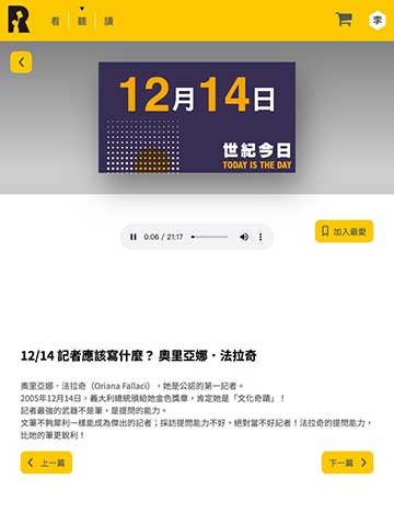
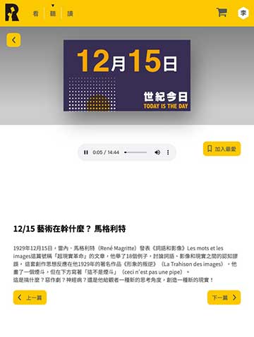
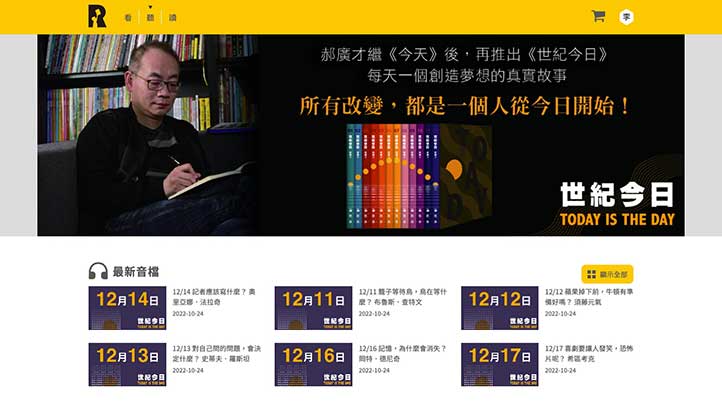
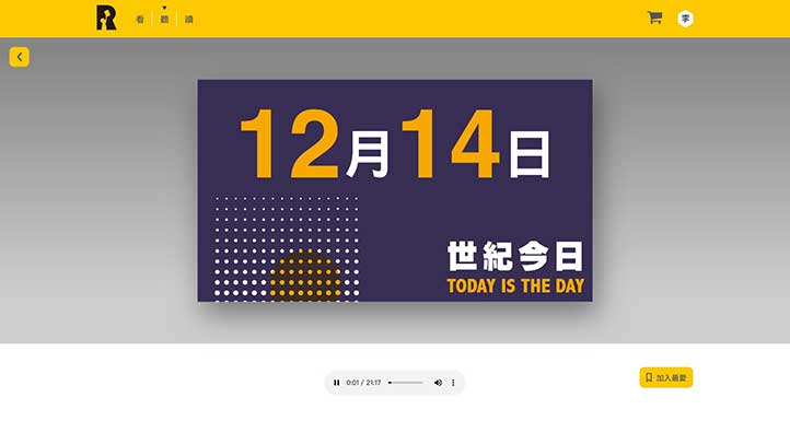
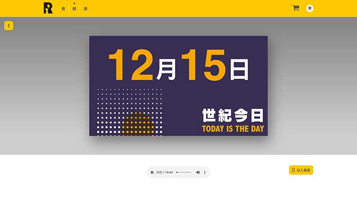
This unit has recorded rich audio files by Green Culture, so that readers can learn a lot of interesting content by listening.
read|
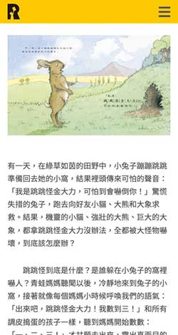
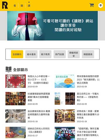
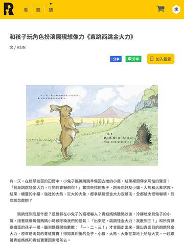
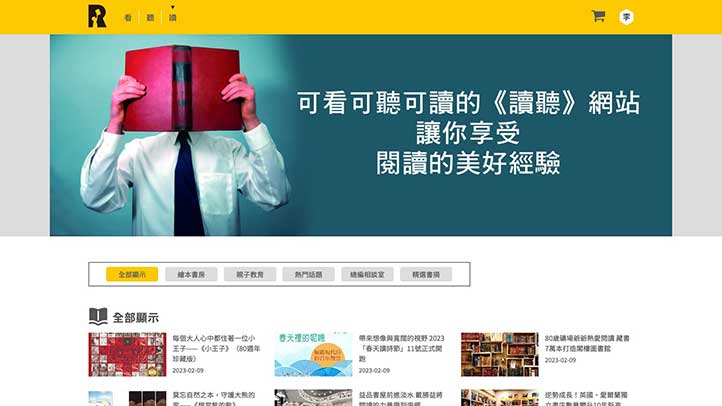
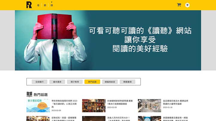
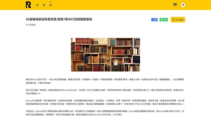
This unit has articles on many topics written by Green Culture, such as: picture book room / parent-child education / hot topics / editor-in-chief chat room / selected book excerpts, so that readers can quickly select interesting content to read.
Color Scheme
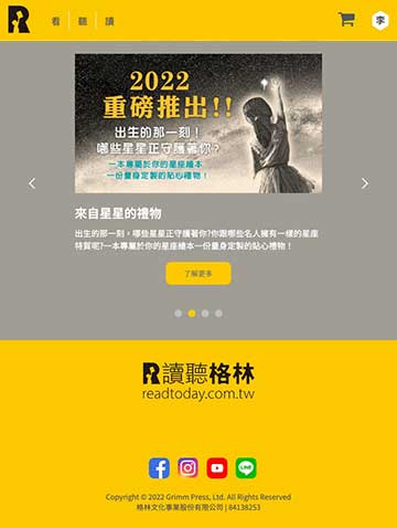
The bright yellow of the standard color is matched with black to create an intellectual and neat feeling.
In addition to the two main colors of yellow and black, the website also uses different levels of light gray and dark gray as auxiliary colors, so that Icons or text can have some different levels.
The design team also used some low-saturation colors as unit representative colors for important units such as watching, listening, and reading, so that the website can be more flexibly matched in color.
R252 G201 B0
#b4d3e2
R205 G205 B2005
#f8f7ef
R160 G157 B148
#6aa2c0
R0 G0 B0
#000000
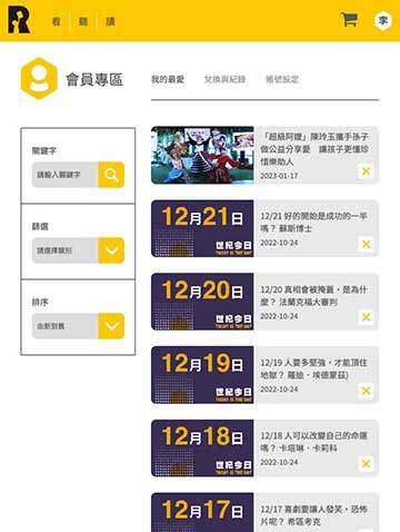
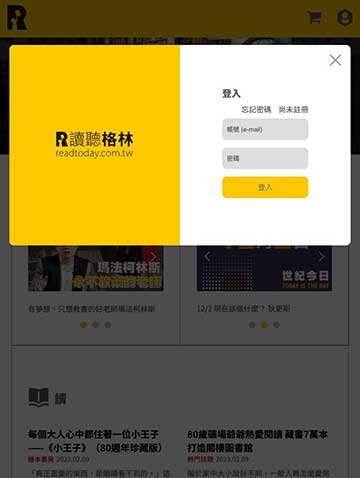
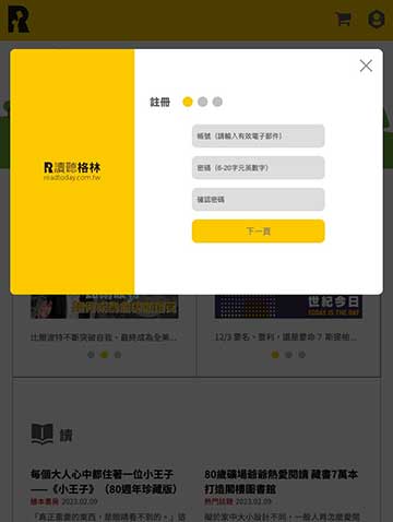
Mobile phone version
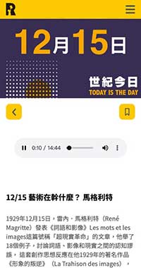
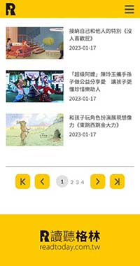
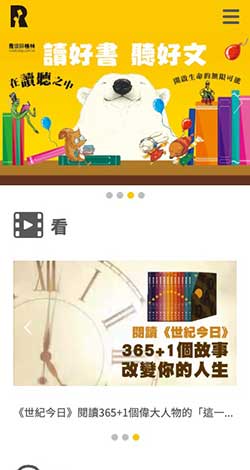
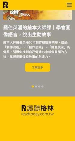
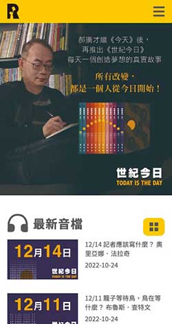
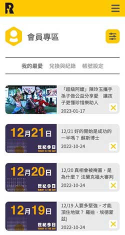
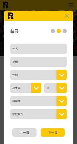
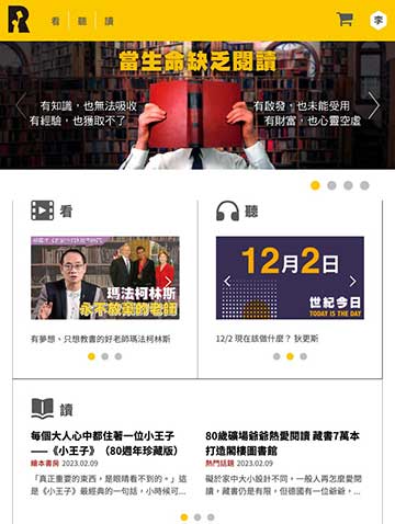
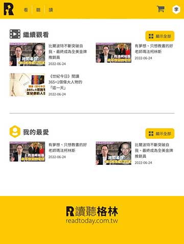
The webpage is designed for the vertical screen of the mobile phone, even with one hand, you can browse the website and all the wonderful graphic content smoothly.
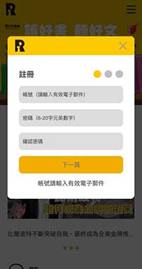
Browsing this website with a smart phone can also get an excellent screen presentation due to the RWD (Responsive Web Design) responsive web design, helping mobile phone users with smaller screens to quickly find the information they need.
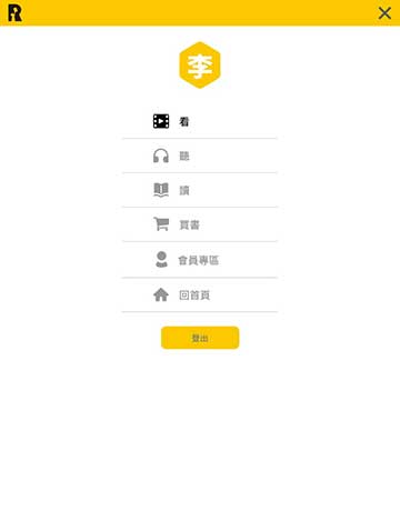
In view of the vertical display mode of smartphones, the design team also optimized the operation interface, using clear menus, so that mobile phone users can quickly switch pages or units to find the information they need.
* Support iOS / Android smartphones.
* ReadToday|Copyright.
Tablet Version
The streamlined and optimized version allows tablets to browse all the great content smoothly.
Browsing this website with a tablet computer can also get an excellent screen presentation due to the RWD (Responsive Web Design) responsive webpage design. All complex elements have been optimized so that the tablet can also be displayed on a smaller screen , to achieve the perfect balance, easy to browse the site.
* Support iOS / Android tablets.
* ReadToday|Copyright.
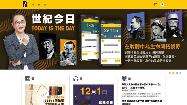
Desktop version
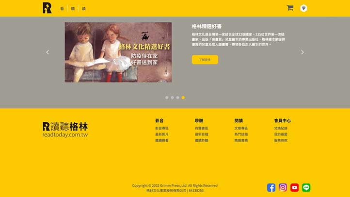
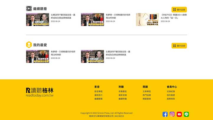
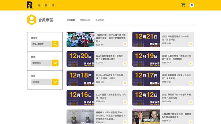
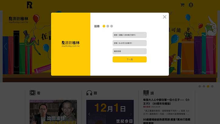
Use a desktop computer or laptop to browse this website, and make full use of the performance of the desktop computer, so that the large horizontal screen can display the best effect.
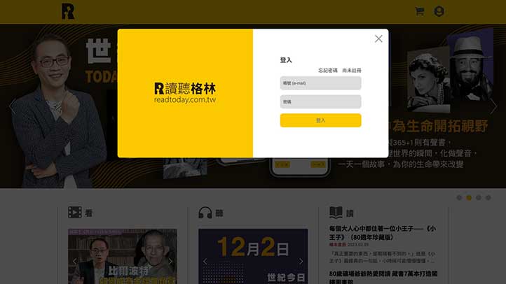
The desktop computer version has the most complete design details and dynamic sliding performance. Regardless of the dynamic sliding feeling of menus and objects, the desktop computer version can have the best performance.
The design team expects users who use desktop computers and laptops to browse the website in an atmosphere of surprise and pleasure.
Designed in the way of RWD (Responsive Web Design) responsive webpage, the display area and readable range of the webpage become larger and wider than ordinary websites, and there will be better browsing quality when browsing pictures or copywriting.
* Supports PC/Mac desktop computers, notebook computers, Chrome, Safari, Edge, Firefox and above browsers.
* ReadToday|Copyright.
Related cases
Related cases
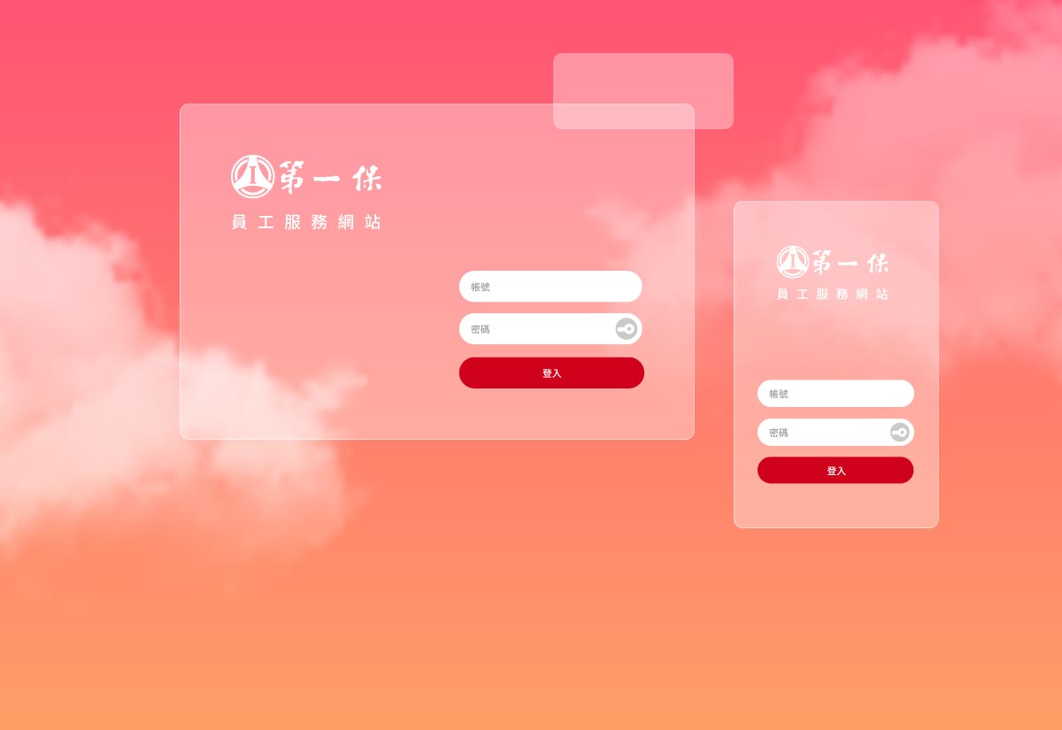
The First Insurance
Employee platform

Related cases
Mercedes-me
content platform

