Basic Introduction
JEAN Group is a diversified enterprise, whose business includes real estate business, construction development, property management, etc.
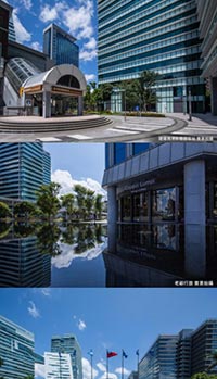
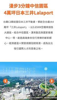
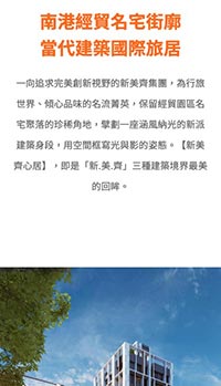
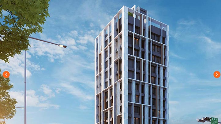
The design task this time is to build a one-page product image website for the construction project of Xinju, and allow potential consumers to quickly understand the entire construction project after being imported to the website, and then contact them by phone or directly go to the appreciating house, etc. .
In response to the increasing importance of smartphones and tablet computers, the RWD (Responsive Web Design) responsive website design method is adopted to meet the overall needs of desktop computers and various mobile devices.

Concept of Design
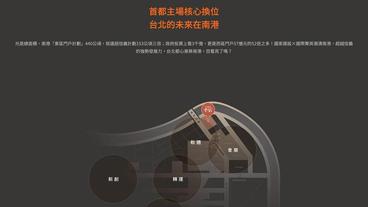
Atmospheric, concise, and international sense are the design axes of the entire page. At the same time, with the RWD responsive design, everyone who comes to the website can quickly focus on the product and guide users to contact or visit the sales center.
Surrounding the construction star of "Xinmei Qixinju", many designs and arrangements are as follows:
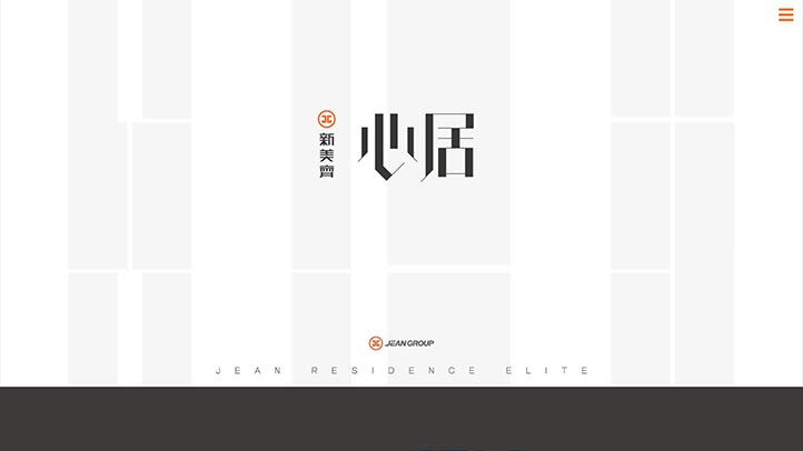
Welcome|Welcome page
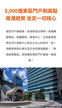
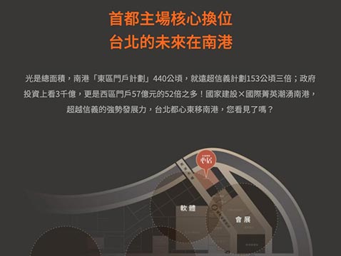
Location|Geographic location and surrounding introduction
Point|Key advantages
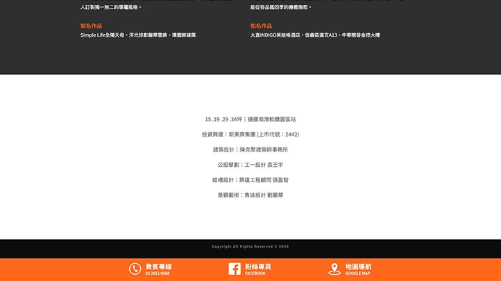
Group|Group and well-known works introduction
Gallery|Architectural interior and exterior gallery
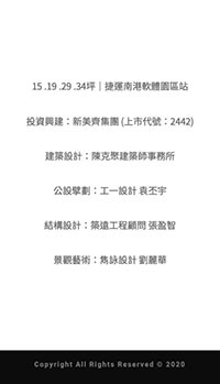
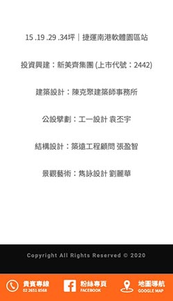
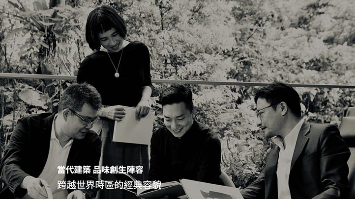
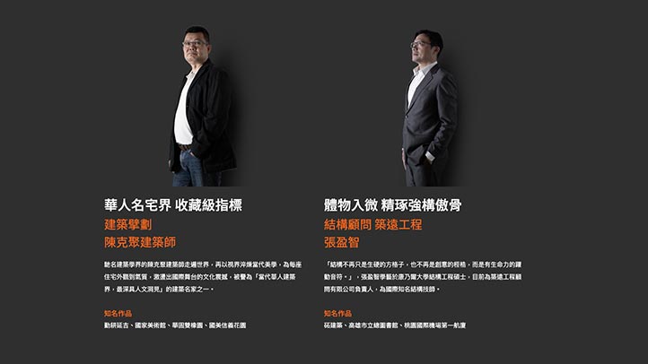
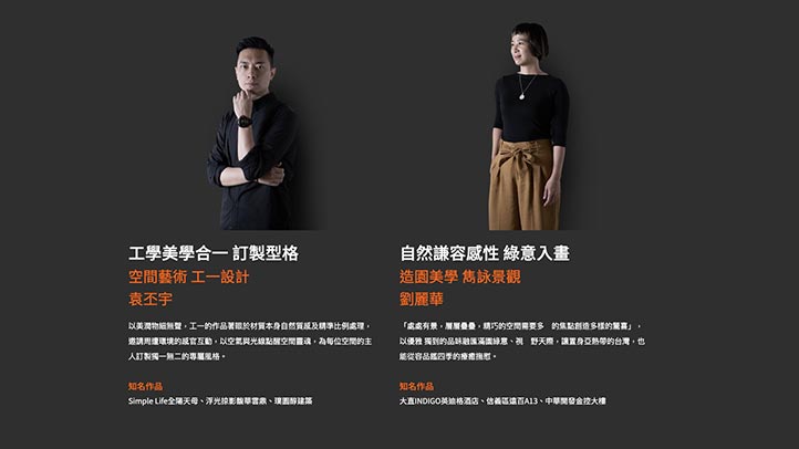
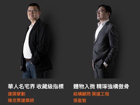
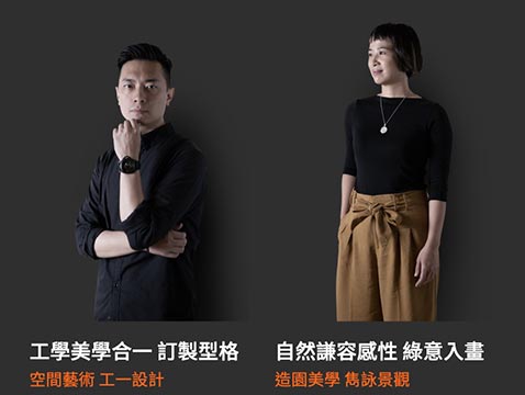
Designers|International Design Team Introduction
Contact|VIP Line/ Fansi Special Page/ Immediate Navigation
In the case of highly complex elements on the same page, RWD can move beautifully and adapt to various screen sizes. The design team has spent a lot of thought on design and execution.
* JEAN GROUP|Copyright.
Color Scheme
This is a product image webpage for house sales. The design team uses different shades of gray and the standard color of bright orange to create a high-end atmosphere.
The design team also used a large area of white and bright orange with high saturation in the website, so that the Icon or text can have some different levels. use.
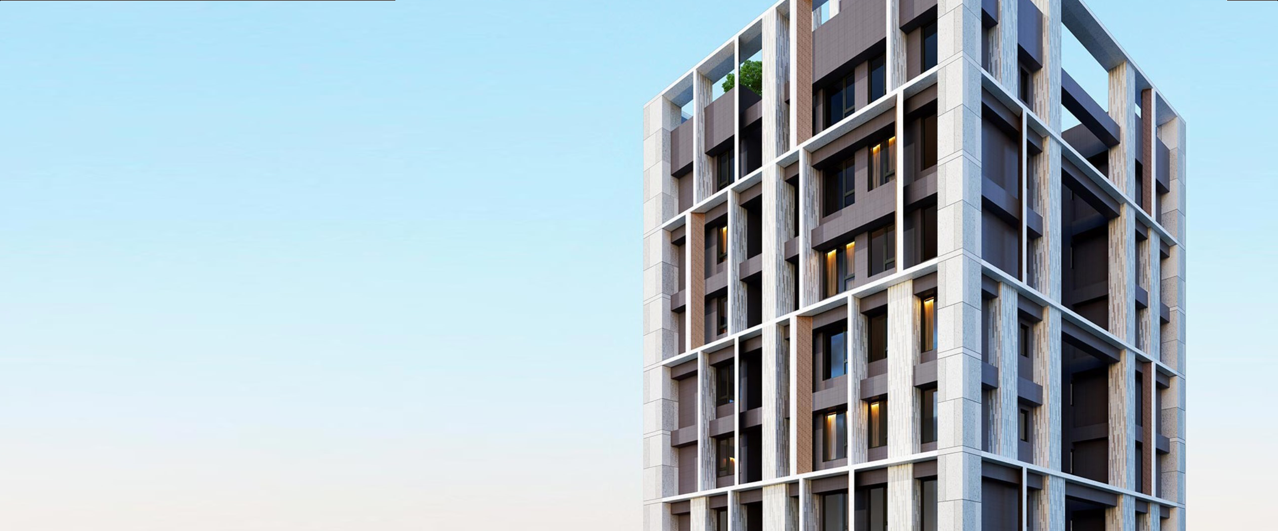
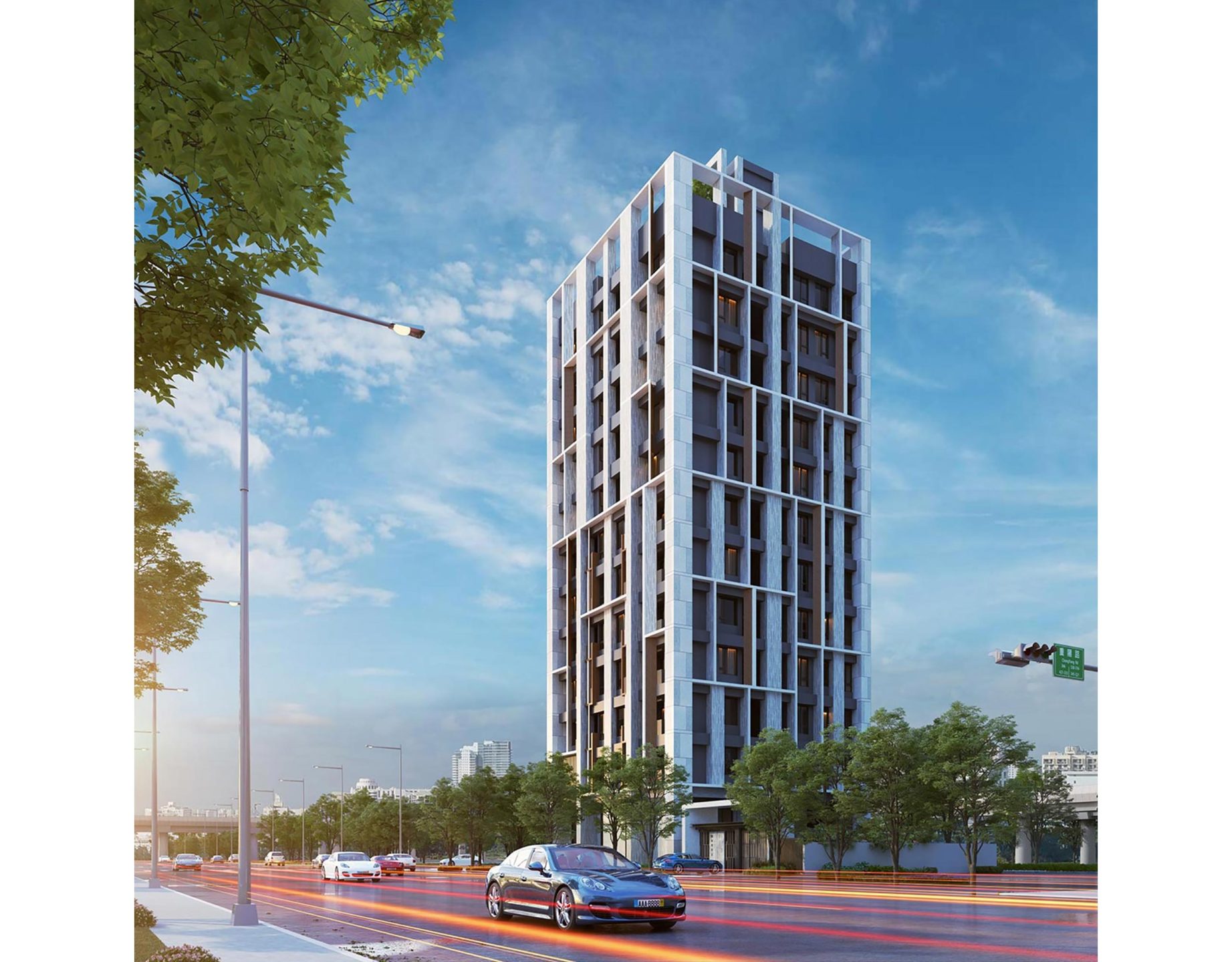
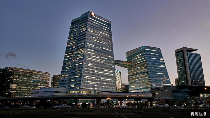
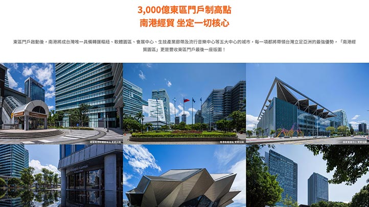
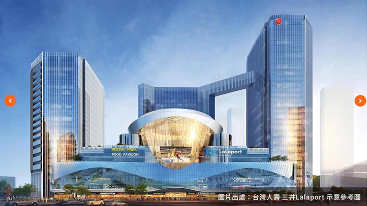
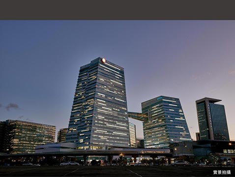
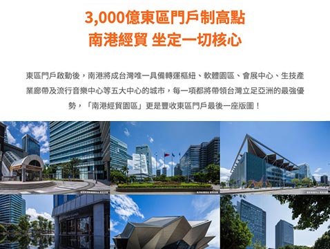
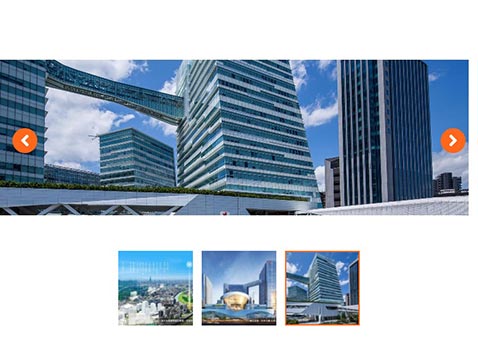
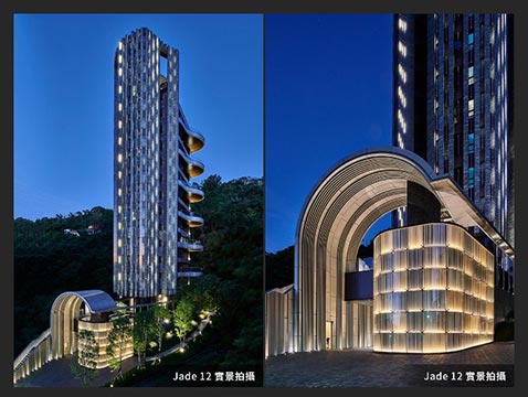
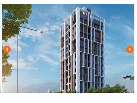
In addition, using a large-area, frameless picture display design as much as possible also highlights the atmosphere of the entire building, and at the same time allows the space of different blocks to be extended or separated.
R255 G103 B27
#FF671B
R62 G58 B57
#71706E
R113 G112 B110
#6aa2c0
R0 G0 B0
#000000
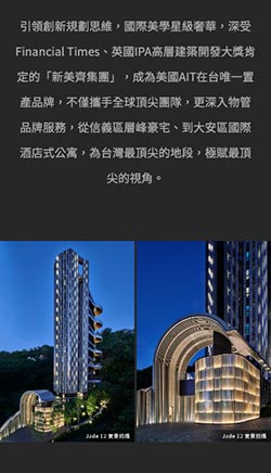
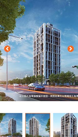
Mobile phone version
The webpage is designed for the vertical screen of the mobile phone, even with one hand, you can browse the website and all the wonderful graphic content smoothly.
Browsing this website with a smart phone can also get an excellent screen presentation due to the RWD (Responsive Web Design) responsive web design, helping mobile phone users with smaller screens to quickly find the information they need.
In view of the vertical display mode of smartphones, the design team also optimized the operation interface, using clear menus, so that mobile phone users can quickly switch pages or units to find the information they need.
* Support iOS / Android smartphones.
* JEAN GROUP|Copyright.
Desktop version
Use a desktop computer or laptop to browse this website, and make full use of the performance of the desktop computer, so that the large horizontal screen can display the best effect.
The desktop computer version has the most complete design details and dynamic sliding performance. Regardless of the dynamic sliding feeling of menus and objects, the desktop computer version can have the best performance.
The design team expects users who use desktop computers and laptops to browse the website in an atmosphere of surprise and pleasure.
Designed in the way of RWD (Responsive Web Design) responsive webpage, the display area and readable range of the webpage become larger and wider than ordinary websites, and there will be better browsing quality when browsing pictures or copywriting.
* Supports PC/Mac desktop computers, notebook computers, Chrome, Safari, Edge, Firefox and above browsers.
* JEAN GROUP|Copyright.
Tablet Version
The streamlined and optimized version allows tablets to browse all the great content smoothly.
Browsing this website with a tablet computer can also get an excellent screen presentation due to the RWD (Responsive Web Design) responsive webpage design. All complex elements have been optimized so that the tablet can also be displayed on a smaller screen , to achieve the perfect balance, easy to browse the site.
* Support iOS / Android tablets.
* JEAN GROUP|Copyright.
Related cases
Related cases
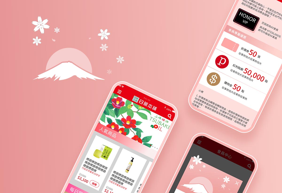
JAPAN MEDICAL
Official e-commerce APP

Related cases
Mercedes-me
content platform

